Interesting concept.
Friday, 26 October 2012
UHAUL // Annual Report
Great layouts. And interesting uses of the different stocks, really adds that extra something to it. And the way that it has been presented is really effective.
Icon Prints: Drinks Series
This is a bit similar to what I thought about doing for part of my Hot & Tasty brief to have some of the icons on the walls. Looks quite effective.
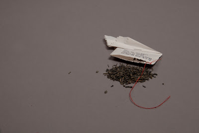
The Dark Tea Rises
I got way too over excited when I saw this. I wish I drank tea because I would do this with every cup. It's a great idea too, and different. Love it.
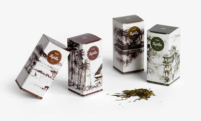
Trip Tea
Interesting way to incorporate the tea leaves into the design itself. Also the colours work really well and tie in with the variety.
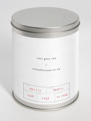
Earl/Grey
Effective design, and represents it well. Simple design on the tin but looks really effective. The grey scale is also a no brainer really.
Flora Foraged Food Restaurant
Strong typography working along side large, strong images. Even though you're drawn to the images, you still notice the type which I think is a great balance because sometimes it just completely cancels it out which isn't effective at all. Great use of colour too to tie in with the different sections.
Kaleid Arts & Culture Magazine
Interesting layouts. And a great way of incorporating more of the logo within the designs for the images. Great way to create more effective layouts.
Public
The typography used in this is bold and confident. Nice colour scheme. Great incorporation of the images within the design too. I need to try and use image more.
Subscribe to:
Comments (Atom)


