Thursday, 8 November 2012
Monday, 5 November 2012
Get Physical Music
Great set of posters. Like the colours used on them.Would love to be able to do something like this, may have to experiment with it in my TE brief.
Booka Shade
Great project with different elements all working together very nicely. Consisting colour scheme across everything and visual elements tying it all up. This is a bit different to what I usually am drawn to but I really like it and wouldn't mind doing something like it possibly in the future.
GPM 100
I really like the colour of this cover, and the use of spot varnish on it too. Looks very clean but not too simple. I want to consider the colour of my cover for my portfolio book.
Tim Dobrovolny
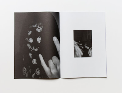
I love this. The layouts are really strong, and let the images work on their own. Also, the cover is screen printed, which is a great idea. Maybe something to consider? Also, do my/could my images work as strongly on their own without explaining the projects? Hmm.
Subscribe to:
Posts (Atom)


