Monday, 26 September 2011
Winter is Red Red
While I was flicking through a book called Zoom In Zoom Out, I came across a project by Design People Studio called Winter is Red Red, which are self promotional items. This includes microsite cards, business cards, poster, letterhead, envelope, t shirts and pins, which has a theme and the same colour scheme used across everything.
Rankin Exhibition
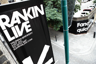
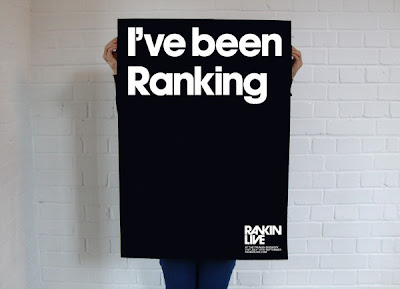
Whilst in London at the Graphic Design Walk, we visited studio Them (link) and Rosa Powloski, one of the designers working there, talked about one of the projects they did with photographer Rankin, and how they got to design everything for his bold exhibition 'Rankin Live'. One of the things that she said that stood out to me with this was that they had a very small print budget to work to for it. I think even though they did, they still did a pretty amazing job.
The way that they have kept each of the things that they have done simple, and just used a bold typeface works really well as it doesn't draw attention from what should be seen at the exhibition. Also, the way that it is all kept visually similar throughout makes the whole thing work as a whole, but if you were to see say the billboards whilst walking somewhere, then later in the day you see a flyer, it will instantly click that they are for the same thing.
Subscribe to:
Comments (Atom)


